Omnivore Books

Let’s get cooking
Designing for the deal-driven user at Omnivore Books.
With retail giants such as Amazon and Barnes and Nobles bombarding bookworm shoppers with a seemingly endless stream of deals and options, independent book retailers who wish to throw their hats into the online shopping ring must design with the intent to both entice and retain buyers.
Tasked with redesigning the webpage for Omnivore Books, an independent, culinary-themed bookstore located in San Francisco, I set out to design an online book shopping experience catered towards the deal-driven user.
Role & duration
UX Designer and Content Strategist
2 week long speculative project
Methods
Information Architecture, User Flows, User Journey Mapping, Usability Testing, Wire-framing, Prototyping, UI Design
So, what’s the problem?
Outdated design and a lack of structure
The original Omnivore Books website features a clunky UI, lack of accessible navigability and browsing options, and offers very little in the way of appealing to a deal-driven user. In order to remedy this, I chose to prioritize functionality and ease of navigation in my design. The greatest challenge I was met with was carving out opportunities for the user to find “deals”, even though Omnivore doesn’t offer them in the traditional sense of a sale-section or free-shipping option.
And the solution?
Stylish simplicity and refined navigability
Pre-redesign, Omnivore Books didn’t allow users to easily find deals, comfortably navigate through the extensive catalog, and peruse past purchases. In order to remedy these problems, I needed to create a way for the user to prevent purchasing errors, find the best deal on various cookbooks, and navigate the site efficiently in order to ensure repeat purchases on the site.
Meet the Deal-Diver
Designing to meet buyer needs

The user archetype I had to design for was the Deal Diver. Since the user research had already been completed for me, it was my job to synthesize the information into something meaningful. In order to do so, I began by designing a user persona as a tool to better visualize the potential wants and needs of my user.
User Journey
Understanding the flow from discovery to checkout
During the fast-tracked, initial two-week sprint on this project, my role as the sole designer varied greatly, and offered me the wonderful, yet somewhat dizzying opportunity to wear all of those proverbial hats. The goal I set forth for myself during the first week was one of understanding. I wanted to get a better idea of how exactly my users’ beliefs and behaviors could be translated into actionable UX entities. So, I began with a user journey.
After mapping out the path I wanted my user to take, I sketched out several flows of specific tasks that would be pivotal in helping the user achieves their goals, such as avoiding repeat purchases, finding bargain buys, being able to comparison shop by price, and saving books to a wishlist for future reference. I was able to integrate all of these user wants into my design through the addition of various features, such as an easily accessible wishlist located in the “my account” section, prominently displayed price tags that showcased the different price points of the same book, a filter by price option, and an order history page.

Behaviors Translated
Turning insights into design
Translating the Busy Buyer’s behaviors into actionable, UX solutions involved thoroughly investigating how their thoughts, motivations, and actions would manifest themselves as design pathways that the user could embark upon. Below, I have a chart that illustrates how the user’s behavior can be understood through tangible actions.

Competitive & Comparative Analysis
What exactly are others doing?
I looked to other online book retailers, as well as popular brands who don’t sell books, who had simple, effective, and streamlined shopping processes and compared them to what Omnivore Books currently offered. I was able to easily understand and navigate the data acquired by creating a graph of commonly offered features.

The Results
The chart revealed that Omnivore is lacking a lot of features commonly displayed on its competitors’ webpages. I took note of the missing features, and carefully considered which ones should be added in order to best meet the user’s goal of finding the best deal on a cookbook. The features that I ultimately decided upon including a wishlist, price comparison on certain books, various filters, and an account where the user can access a multitude of past and future buying options.
The Old Website
Hard to navigate, difficult to use
The original design of the Omnivore Books website as I found it can be seen in the images below. It is clunky, confusing, and lacks any sort of clear navigational structure. The lack of call to action buttons, confusing information architecture, and inconsistent sizing of images and text creates a poor e-commerce experience for the user. The website was in dire need of a complete re-design.

Information Architecture
Content meets redesign
I conducted an intensive content inventory of the various links, products, and information that was displayed on the original Omnivore Books website with the goal of improving the site navigability. In order to allow the user to easily find the product or information they were searching for, I rearranged and reorganized the different site features into easily navigable buckets that would ultimately serve as a blueprint of the final site navigation schema. Prior to my redesign, there were no defined or readily recognized navigational patterns implemented on the website.

Open and closed card-sorting
Does this make sense?
After I created a final draft of the site’s new IA, I wanted to test out if my design actually allowed for simple navigation and made logical sense to the most important person: the user. I conducted 5 open card sorts, each with different individuals, to see the ways in which they grouped things similarly or differently from me. The end result was that while I seemed to get a fair amount of it “right”, several adjustments needed to be made, particularly in the “events” and “checkout” section.
So finally, after a couple of clicks, several drag and drops, and a deletion or two, I had my finalized IA for the new Omnivore Books website.
Wireframes
Initial patterns and design
This is the part where I make wireframes, and transform the insights that I gleaned in my research into actionable, viable design decisions. The wireframes I designed hinge upon adding elements and features that were either lacking or completely non-existent on the original, and somewhat barren, Omnivore Books site. I choose to focus on 5 specific tasks that I felt would best help the Deal Diver meet their specific goals.
Task 1
The first task that I designed for is filtering books by price. Prior to my redesign, the Omnivore Books website did not offer the option to apply a filter to any of their search categories or pages. This made it very difficult for potential buyers to be able to sift through all the clutter, and actually find the read that they were looking for. Since the Deal Diver’s main purchasing motivator is driven by cost, specifically bargains, I thought it best to allow them to easily navigate to and scan books that would please their wallets.

Task 2
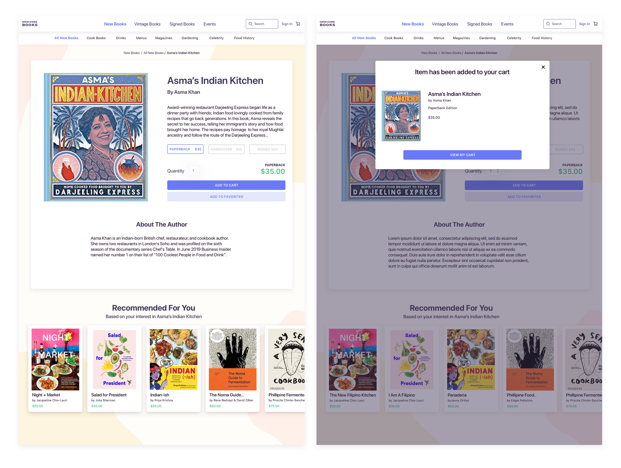
The second task involves navigating to a book, scanning the price comparison options listed on the page, and adding the book with the appropriate price point to their cart: this can all be done on a single page. The first wireframe in this series features a large image of the book, the author and book description, various price points that the book is selling at, an option to save the book for later by favorite it, books of similar content and price in the recommened for me section, and most obviously, an add to cart button. In having all of these various options available to the user on a single screen, they would be confident that they were 1. Making the best purchase for their budget and 2. Be prompted to make additional purchases within a similar thrifty price range.

Task 3
Hoorah! It’s finally time for the user to make a purchase and start cooking that yummy shakshuka they've always dreamed about. These wireframes are focused on the ecommerce portion of online shopping, including but not limited to: inputting one's personal info and shipping address, choosing a shipping method, selecting a payment option, and finally getting a confirmation receipt including relevant purchase information.

Task 4
Two of the primary behaviors of the Busy Buyer is that they have a tendency to make purchasing errors (such as repeat purchases of the same product), and they like to fully scavenge the internet in search of the best possible deal. I chose to address these behaviors by designing a create an account option. The ability to create an account deals with both of these tendencies in two very different ways, and is illustrated in the final task.

Task 5
Once the user has an account, they can quickly and easily navigate to their order history in order to ensure that they have not previously made the same purchase on the site. Second, having an account allows the users “favorited” items to be stored in one, consolidated place. They can favorite books they are considering buying, navigate away from the site in search of a better deal, and (hopefully) navigate back and purchase their thrifty find without having to rummage through the site all over again.

Usability Testing
Let the user decide how well it works
Then came the fun stuff: interactive prototyping and usability testing. I did 10 rounds of usability testing centered around three specific tasks: creating a user account, sorting books by price or utilizing the “deal of the week” feature, and making a purchase.
I used a SUS (system usability scale) calculator to measure my results, and was pleased to receive a score that averaged 99.25.
All of the users found the new design intuitive and easy to navigate. The new site features, such as price filters and price comparisons, allowed users to seamlessly navigate towards the book/s they wanted to purchase.

The New Omnivore
Tasteful changes for the voracious consumer
The final design is one that allows the user to easily navigate the site’s web pages, find deals, browse through a plethora of book titles with ease, create an account to track purchases, and encourages the user to make repeat purchases.
I created a style guide that served to modernize the old website through the use of modern and trendy design patterns, such as rounded corners on buttons, bold colors and drop shadows, a card style to bring clarity and UI unity, and a background that makes the books POP!

A New Home Page
I made numerous updates and design changes to the homepages, including the ability to choose what book “you’re hungry for” which allows users to easily browse through different cuisines featuring books at an accessible price-range. Additionally, I choose to emphasize the imagery on the homepage, making it more visually appealing and enticing. The original Omnivore books webpage was blank, monochromatic, and failed to accurately display the beauty of many of the book covers.

Fun Yet Refined
The new UI of the Omnivore Books website elevates the brand and the online shopping experience by not only offering users a more visually enticing experience, but an easier navigation process. Clear call to action buttons, filters, search functionality, and recommendations bring joy the joy and excitement that is foundational to retaining customers in the E-Commerce era.


Results & Reflections
All that was learned (and then some)
It was important for me to meld business goals with user goals during every step of my design process. Since Omnivore’s business model does not currently offer any sales or deals online, I was tasked with designing innovative ways to make it seem as if those deals did in fact exist. The bits of knowledge that I came away with at the end of the project include:
Incorporate the user into your design. Understanding the users behaviors and motivations, and how they may influence purchasing habits allowed me to tailor the design to meet their needs.
If you can’t change the business model, change the language surrounding it. Just because Omnivore did not want to offer discounts on its books online, didn’t mean that those deals didn’t exist. Designing deal-driven opportunities for the user involved 1. doing a complete inventory of the items offered on the site 2. figuring out how to best display those items on a webpage so they could provide the user with that elated “I just found a bar
Containers have to follow content; couldn't make a sale section if the store didn’t offer sale books. It was a challenge and a learning experience to figure out how to entice users motivated by money without red tags.
Direct competitors aren’t always the best source: it was far more fruitful to look at retailers that didn’t specialize directly in books. Clothing and cosmetics retailers provided far more effective solutions for my buyers specific problems because of their niche offerings and audiences.