Boxy

Tackling clothes waste, one box at a time.
Designing sustainable solutions for the environmentally conscious consumer
In recent years, a plethora of big name brands and their consumers have made a concerted effort to leave less of an ecological footprint. As the effects of climate change are felt more acutely, actions such as recycling, up-cycling, and leading a zero-waste lifestyle have become more prominent and important than ever. The issue of clothes waste however, remains a difficult one to tackle. Boxy aims to relieve the pain many users face when they want to downsize their closets, but don’t have the time to actually lug all of their goods to a local thrift store. Boxy sends users a box to fill with their unwanted clothing, appraises the items, and donates the funds to an eco-friendly charity of the user’s choice. Boxy empowers users to declutter their lives and give back to our planet.
Role & duration
UX Designer, Researcher, & Content Strategist
1 week long speculative project
Methods
Interviewing, Affinity Mapping, User Journey, User Flows, Storyboarding, User Archetypes, Competitive / Comparative analysis, Feature Prioritization, Paper Prototyping, Wireframing, Rapid Prototyping, UI Design

The Challenge
Sorting through the rubbish
After conducting a bit of research on the topic of clothing waste, I uncovered some pretty shocking and disturbing facts. Like, for example, the average American discards approximately 82 pounds of textiles per year, resulting in 11 million tons of clothing waste produced by just the United States alone.
It quickly became evident that the challenge I was faced with was “how might I entice users to recycle more of their unwanted or unworn clothing”, and thus reduce the total amount of clothing waste produced.
The Proposed Solution
It’s time to clean up our act
Boxy, a mobile application that allows users to request a pre-addressed box to mail back with their unwanted clothing items, will incentivize users to declutter their closet, reduce their eco-footprint, and contribute to the recycle + up-cycle movement.
The success of the application can be measured quantitatively through the number of boxes requested and donated per user.
First Steps: Discovery
Taking a closer look at the story
The beginning of Boxy’s journey from concept to app began with research. During the research phase of the design process, I wanted to focus on three main components:
1.Interviews with users
2. A competitive and comparative analysis of other clothing donation companies and services
3. A deep dive into apps that function similarly, but uphold a different business model
User Interviews
Asking the right questions
Before interviewing the users, I took some time to carefully consider and write out the interview questions that I felt would be the most conducive towards gaining the information I was looking for. Initially, this was a bit challenging, as I didn’t want the questions to be leading, or promote any sort of confirmation bias. The top three things that I wanted to learn during the interviews were
Is there a need for the Boxy app?
How would users best interact with it?
What are the current pain-points that users face that could be alleviated with Boxy?
Once I had a better understanding of the foundational questions I wanted to explore, I conducted 5 user facing interviews with a demographically diverse pool of users.
The results
The interviews revealed several recurrent pain points that every interviewee experienced in relation to recycling their unwanted clothing. The most popular statements include the following:
“I own too many articles of clothing”
“The process of donating clothing isn’t satisfying or reliable”
“I don’t have the time to go to a donation location”
Affinity Mapping
Themes in thought emerge
I choose to make an affinity map of the interview results as a means of grouping together common themes, pain points, and user needs. The affinity map acted as a wonderful tool in bridging together personal sentiments with collective experiences. Some of the discoveries I made through affinity mapping include the following:
People own too many articles of clothing, and this often acts as a point of stress in their lives
The process of discarding or donating clothing is often laborious and unfulfilling
Beyond needing more space, the second biggest motivator for donating clothing is getting money in return
The current process of donating clothing is time intensive and should be streamlined

Who are our “target” users?
Designing the right product for those who need it the most
After I synthesized the user interview data, I was able to better identify my target users, their needs, and their pain points. I wove together this information to create several user personas that are strongly rooted in research. Each persona illustrates the motivations, barriers, and needs that different Boxy users could potentially have.

Storyboarding
Illustrating a familiar narrative
For the next step in my process, I decided to draw out a storyboard illustrating the entire door-to-door experience a user would have with the Boxy app. Once complete, the storyboard allowed me to better predict and explore a multitude of paths the user could embark on.


Competitive & Comparative Analysis
Who else and HOW else
Since I now had a working idea of who I was designing for, I needed to look at other products or services that offered a similar experience. I conducted a comparative and competitive analysis with 3 different companies who all engaged with at least one facet of the clothing consignment / recycling industry.
The companies I choose to look at include:
Depop
thredUP
Buffalo Exchange
Goodwill
Salvation Army

Synthesizing industry results
The good, the bad, and the ugly
After I had finalized my list of competitors, I began to define my assessment criteria. I choose to focus on the two main factors that I thought would make the most impact for the user, which include:
A heuristic analysis
Goals and features
In order for me to best understand these two features, I had to take a deep dive into the architecture of each company, including but not limited to, their websites, mobile applications, and in-store offerings. It quickly became apparent that while all five of these companies offer the same service, there are major discrepancies between their business models and how they allow users to interact with them.

Industry Insights: The major differences
Difference one: Inconsistent onboarding
Each app and service featured a uniquely different and idiosyncratic onboarding process.
Depop: Currently, Depop has a 4 step onboarding process that includes cell phone verification, email verification, password creation, and generating a unique screen name. After you complete these steps, you are immediately prompted to create your shop (which takes an additional five steps). In total, it takes 9 steps of onboarding before you can begin to engage with the app.
thredUP: 2 step onboarding process that requires entering an email address (this will serve as your login username) and a password. The time it takes to engage with the app is very quick and concise.
Buffalo Exchange + Goodwill + Salvation Army: No onboarding process required at all since purchases and donations must be made in person.
Difference two: incongruent mission statements
Much like the on-boarding experience, the differences in mission statements was wide and varying. In general, it was split fairly evenly between either an ethos centered around fashion, or one that was almost purely donation based.
Depop: Cited as the “gateway to influencer status” by The Atlantic, Depop is an online marketplace that encourages creativity and “it-girl” branding techniques by its user. It’s Instagram inspired interface gives the app a social media feel that encourages users to not only engage with the items they wish to purchase, but also with the seller themselves. Less about environmentalism, and more about the cult of self-branding, Depop prioritizes fashion over environmental activism.
thredUP: Proudly calling themselves the “world’s largest online thrift store”, thredUP has cut out the pain of actually having to go to a thrift store to donate clothing. Their goal is to start a “resale revolution”. On thredUP, you can request a bag to fill with your own clothing, and then mail it back for an account credit. The limitations of this however, is that the appraisals are often low, and you are restricted to spending on the site.
Buffalo Exchange: Buffalo’s mission statement can easily be found on their website’s homepage. It states that Buffalo’s mission is to “lead the resale fashion industry, provide a livelihood for its employees, a fair return to its owners and achieve sustainable profitability by being the most beneficial place for its customers to buy, sell and trade new and recycled clothing, have a rewarding workplace, act with integrity, function in a socially responsible manner, [and] promote fun and enjoyment”. Need I say more?
Goodwill: Unlike the aforementioned companies, Goodwill is less about the “resale revolution” and more about social good in and of itself. The three main components of Goodwill’s business model includes donations, jobs, and shopping. However, Goodwill still remains one of the largest and most commonly used centers to donate unwanted clothing -- mainly because they will take *almost* anything.
The Salvation Army: Like Goodwill, The Salvation Army is also focused on the larger cause of social good. As one of the largest charitable organizations in the United States, The Salvation Army is committed to assisting individuals both locally and globally. The Salvation Army allows you to either schedule a pick-up or visit a donation site when donating goods.
Difference three: fashion vs function
Each product or service saw the most discrepancy when it was compared under the terms of fashion vs. function.
Depop: Depop prioritizes fashion over any sort of social good or environmentalist ethos. Its service is limited solely to mobile use, which encourages users to engage with it more like a social media app than its competitors.
thredUP: thredUP artfully merges both its environmental activism with a desire to sell trendy clothes. The user can easily choose to engage with them either mobile or online, which expands the companies user reach.
Buffalo Exchange: The middle ground between Depop and thredUP, buffalo exchange prioritizes fashion, but also integrates its sustainability practices into their mission. Currently, the only way to donate or purchase clothing from Buffalo Exchange is to visit the store in person.
Goodwill: In order to donate to Goodwill, the user must physically go to a donation site, and fashion is not underscored in the process.
The Salvation Army: Like Goodwill, fashion is not a priority for the Salvation Army. However, you are able to donate to them without actually having to go to a drop-off site, which elevates some of the burden for a user.
Sketching and Beginning Design
Emerging structure


With the research component completed, I was able to continue onwards in my design journey. I began by sketching out several task flows by hand, which were later iterated upon and refined in my user flow charts.
Here, I refined my initial sketches, and thought through the exact process I wanted my user to take. Some factors that I kept top of mind during this stage of the design process included heuristics, ease of use, accessibility, and most importantly function. I applied the question of “why” to every design design made here in order to ensure that I didn’t add any unnecessary, confusing, or downright repetitive features.
Paper Prototyping
Testing for viability
Since I had a fairly fleshed out idea of how I wanted users to engage with the app at this point , I decided to quickly create a paper prototype to learn if my design was user friendly and how it could be improved. The three tasks I asked users to complete included creating an account, requesting a donation box, and tracking the status of their box. All 5 of the users I tested with where able to complete all 3 tasks in under 3 minutes. Success!!!


Paper prototyping Task 1: Create an account
Here, the user was prompted to create an account. During the paper prototyping sessions, none of the users seemed to have difficulty with this step, and even stated that the flow felt “easy”, “intuitive”, and “quick” to navigate through.

Paper Prototyping Task 2: Request a box
The second task that I had users do was request a donation box from Boxy. Since the landing page of the app features a large call to action button that exclaims “request box”, and few other features, the users seemed to breeze through this step very quickly. None of the users had difficulty navigating this page. However, some insights that I gleaned that helped inform my later design decisions included changing the box size requisition screen and the confirmation page. I took note of these suggestions, and later incorporated them into my final design.

Paper prototyping Task 3: Track order status
The final task I had users complete was to track and receive information about a previously ordered box. Again, all of the users passed the test quickly and without much effort. My initial design decision to have both the box requisition button and the past purchases button on the same screen was revised but preserved, and can be explored in more detail in my final UI design.
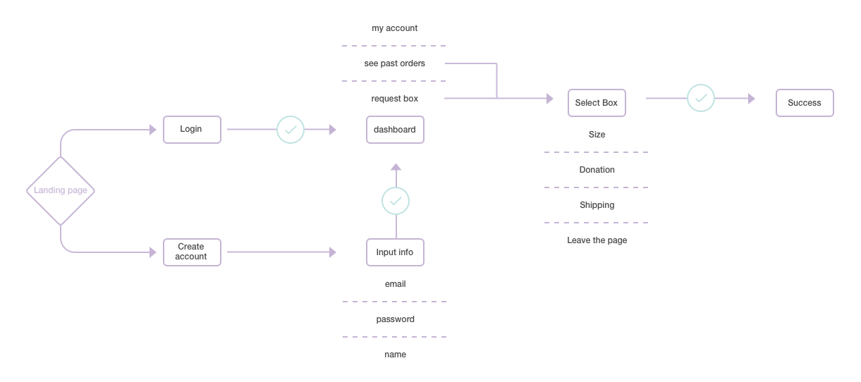
Wireframes
Designing the application
We have finally made it to wireframing. However, before I could get to all the fun of creating rectangle after rectangle in Sketch, I wanted to do some (quick) research of design patterns that already existed. I looked at a variety of different apps, and took note of which styles, sequences, and motifs could inform my design. One key consideration that stayed with me the entire time I was wireframing was that I wanted to design something clean, elegant, and easy to use.
Task 1
Much like the first prototyping task, I began by designing wireframes that created a seamless onboarding experience that both explained the purpose of the app to the user, and allowed them to quickly create an account. The decision to include a carousel and a quick three-step onboarding process serve to acquaint the user with Boxy, and get them engaged with the service as simply as possible. These wireframes act as the first step in building a relationship with the user.


Task 2
The second task features the bulk of Boxy’s functionality: choosing a box size, inputing delivery information, selecting a charity to donate to, and receiving a confirmation of order.


Task 3
The third task features three distinct parts: accessing your Boxy profile, tracking a past order, learning how Boxy’s donation and pricing system works, and navigating to the charity that you donated to.


Usability Testing
Fixing Flaws
With the wireframes complete, it was time to figure out how well they worked (or didn’t work) according to real users. I conducted 6 usability tests with the help of an interactive prototype I created in InVision. I used a SUS usability scale to measure my results, which averaged a 98.8% rate of approval. However, even though all of my users passed the usability test, I noticed several opportunities for improvement in how they interacted with the app, particularly on the donation screen. I later revised this in my final UI.
Animation Experiments
Keeping the user engaged
I had an idea of how I wanted some of my key flows to work, specifically, selecting a box. For this part, I downloaded and experimented with Principle. I animated some basic micro-interactions to see how the app might come to life with added movement.

The “swipe” model.

The “jump to” model.
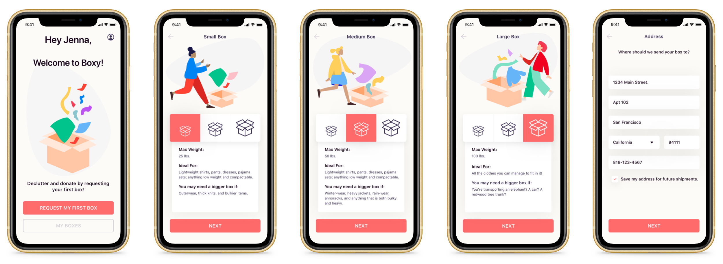
Final UI
Funky, colorful, and Earth friendly
Ta-da! With a quick snap of the fingers, the utterance of a magic mantra, and (many) hours of work, the final UI finally came together. Colorful and clean, but also fun and inviting, Boxy’s design speaks to both aesthetic and functionality and prioritizes the user at every step.


When creating the style guide for Boxy, I wanted to incorporate fun, bright colors that brought a vibrant energy to the application. After all, recycling should be fun, right?! I choose San Francisco as the typeface because it is clear, legible, and professional, which balances out the color palette. I created new vector images and edited existing ones in Sketch to better illustrate the app.
First Impressions
First impressions are everything, which is why I wanted the initial screens that users saw to be clean, yet fun. Each screen explains a different aspect of the application, and orients the user to Boxy’s service. Users are also given the option to request their first box or sign into the account.

Signup
I wanted to keep the signup process as simple as possible — so I narrowed down the screens to the essential information that would be needed in order to create an account: an email, a password, and a name.

Selecting A Box
Once the user has created an account, they are taken to a screen that allows them to request a box, view past orders, or access their account. I wanted to keep the ordering process simple, yet informative. Selecting a box size triggers a state change that notifies the user where they are. Once the user selects a box size, they are taken to another screen that prompts them to enter the mailing address where they wish to receive their box.
Selecting A Charity
It was important to me to keep the donation portion of the app as clean and informative as possible. I choose to incorporate black and white renders of each charitable organizations logo, as well as a brief description of who they serve. Here, the user can “flip” through the different cards in order to find the organization that most aligns with their needs.

Checkout
Once the user has selected a box size, entered an email address, and chosen a charity to donate to, they will see an order confirmation screen that allows them to either complete their order, or exit. Once an order is complete, the user is immediately taken to a screen that allows them to “finish” the process and go back to the home screen, or share their donation on social media.

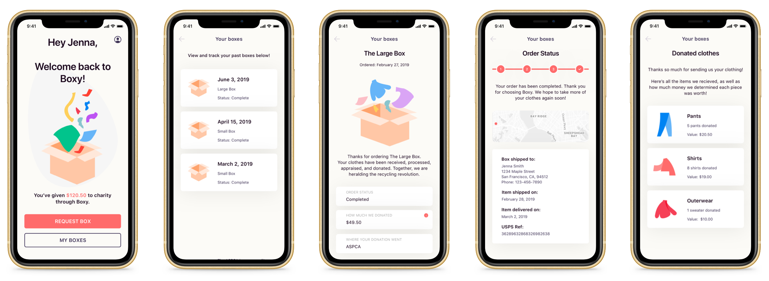
Ongoing Use
Ongoing use is crucial to how any user engages with an app. I designed features that I felt were the most vital helping the user access past order information. learn about pricing and appraisals, view their donations, edit their profile, and see the total amount they have donated to organizations through Boxy.

Results & Reflections
With Boxy complete, it was time for me to sit down and reflect upon the good, the bad, and the ugly. Here’s what I learned
Direct competitors don’t always lend themselves to conducting the best comparative / competitive analysis. Sometimes, it’s better to look at services and apps that aren’t related in product, but are somewhat similar in process.
A LOT can be done with vector tools.
Two of the most important elements of UI design are patterns and consistency.